
New design, better usability: monkkee becomes clearer and more mobile-friendly
The monkkee interface has evolved: the sidebar, which was an important part of the navigation for a long time, is gone. In its place come a tidy toolbar and a search that takes several criteria into account at once. Managing and assigning tags has also become easier.
Less sidebar, more room for content
The sidebar was designed for large desktop screens. In the responsive design it became a compromise for smaller displays: on mobile devices it moved below the content, which made it easy to overlook and awkward to reach.
Today we focus more strongly on mobile devices. Important functions should be immediately easy to find and reach there.
That is why we moved the most important actions into the toolbar. Right where entries are edited and managed, they are more visible and reachable with fewer detours.
A search that combines filters
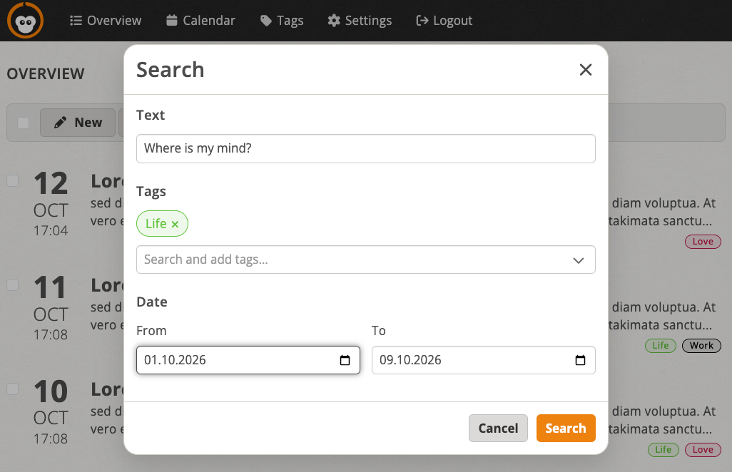
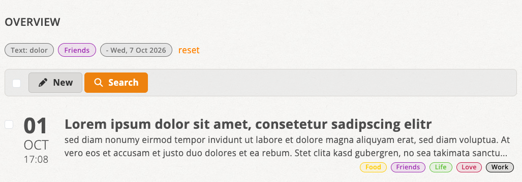
The search now has its own dialog. Instead of using text search, tags and dates separately, you can combine these criteria there:
- search by text,
- select multiple tags,
- set a period with a from and to date.
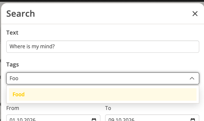
The tag selection also offers a typeahead search: you can type a name, and the matching tags are filtered right away.
Toolbars with fitting actions
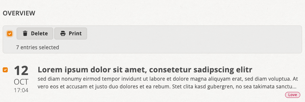
The toolbars have become easier to understand: where space allows, a short text now appears next to the icon. On the entries overview, the available actions also adapt to the current state. Without selected entries, “New” and “Search” are available. As soon as entries are selected, the actions for deleting and printing appear instead.
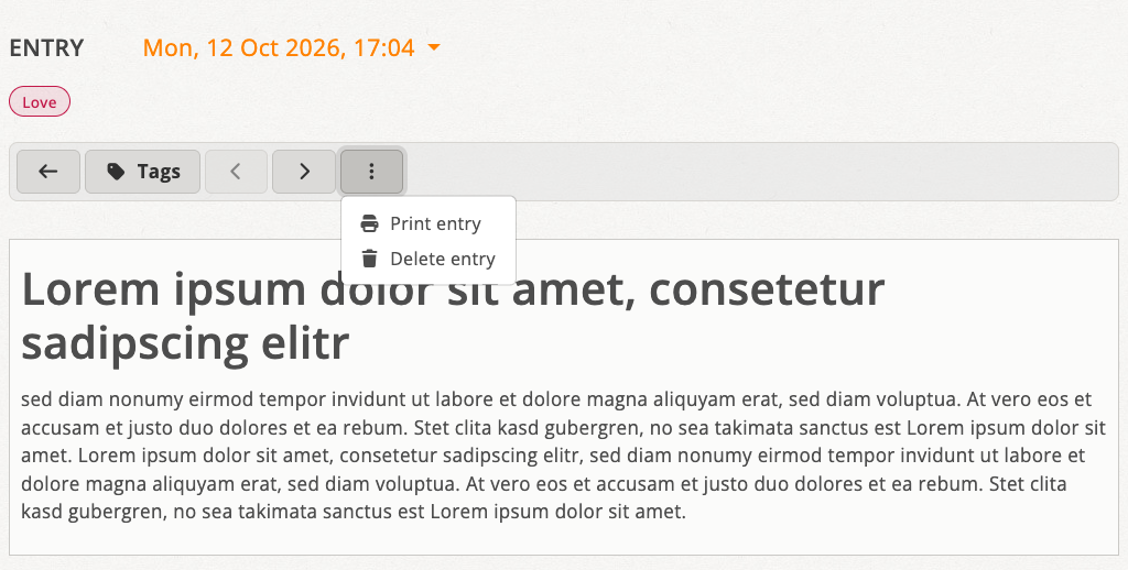
On an entry’s detail page, the less frequently needed actions “Print” and “Delete” are grouped in a menu behind the three-dot icon. Navigation between entries and tag assignment remain directly available in the toolbar.
Assigning and creating tags more easily
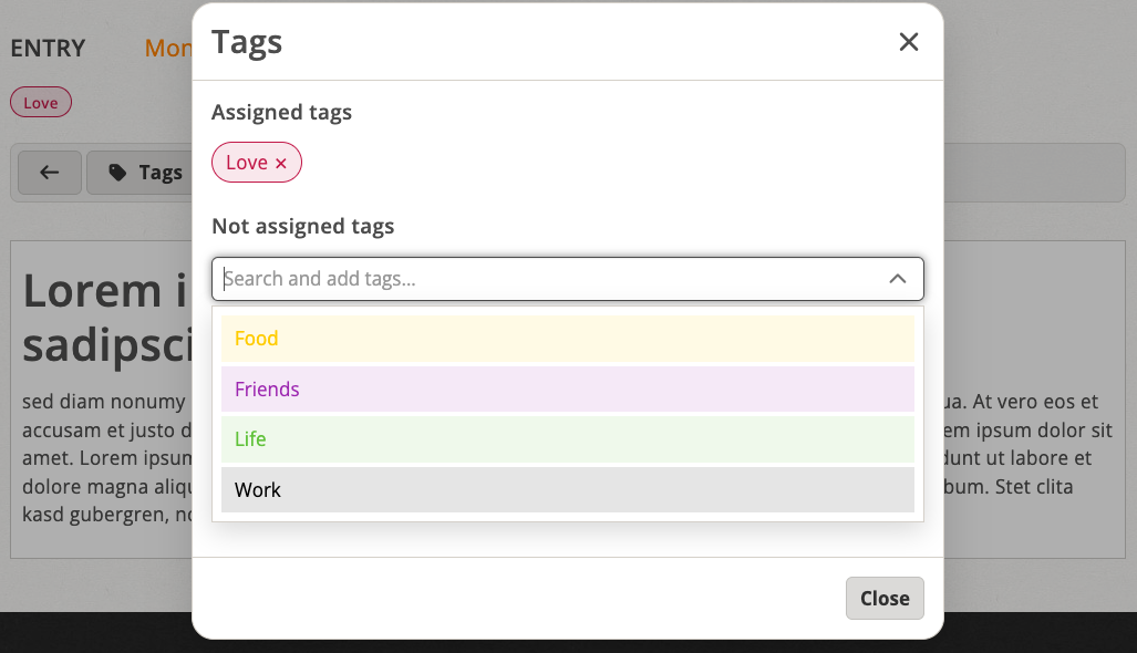
Tags are now displayed consistently everywhere as clear, attractive chips. Assignment works through a dedicated dialog that clearly distinguishes between assigned and available tags. Here, too, a typeahead search helps you find the tag you want quickly.
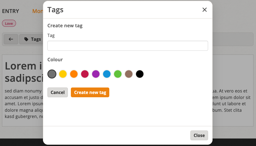
New tags can be created directly from the dialog. You can choose the color right when creating a tag. This removes an additional editing step and makes tags easier to tell apart from the start.
A clearer tag management page
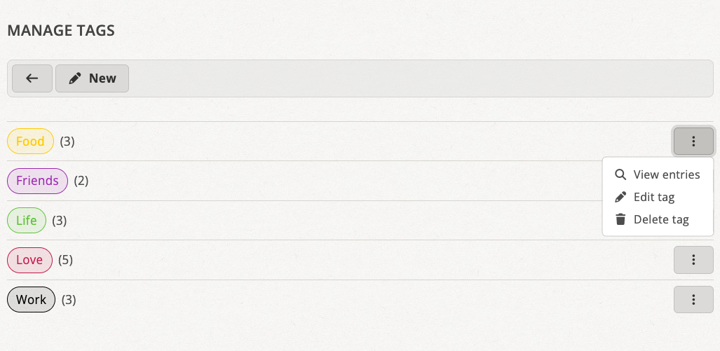
The tag overview page has been revised as well. All tags appear in a clear list using the same chip design as in the rest of the application, followed by the number of times a tag is used in parentheses. Long names are shortened so that the layout stays stable even on small screens. The actions for each tag – show entries, edit and delete – are grouped in a menu behind the three-dot icon. New tags can now be created directly on this page using the “New” button in the toolbar. It uses the same form as editing, where you set the name and color.
A step toward tidier mobile use
The changes share a common goal: the interface should not feel like a shrunken desktop version on small screens. Important actions remain quickly accessible, while search and tag management get more room for clear and focused use.